top of page
Danielle's Art Portfolio
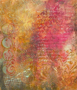
Color harmonies are combinations of colors that create balance and visual appeal. In this project, I used triadic, square, and analogous color schemes. I think the triadic harmony turned out the best because it created strong contrast and vibrancy. Overall, I suck at this, but I hope my audience notices the effort I put into experimenting with different color relationships.

Analogous color harmony

Square color harmony

Triad color harmony
bottom of page